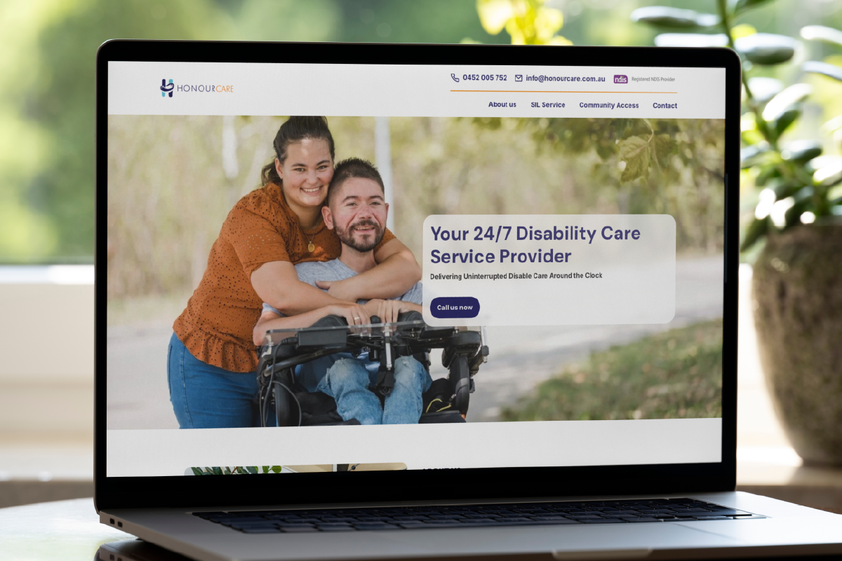
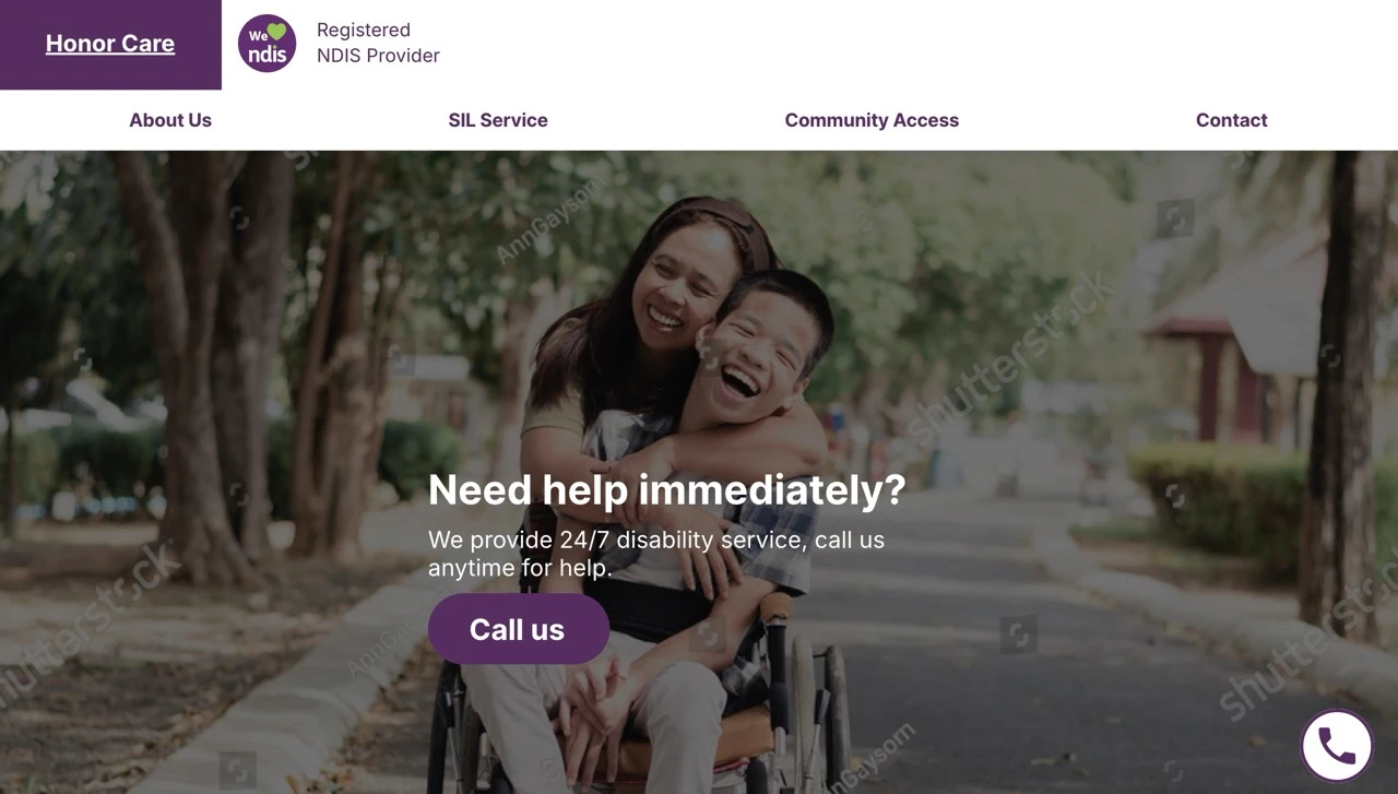
Honour Care

Honour Care is a 24/7 disability care provider in Southern Brisbane. My task is to design a website for them, aiming to bring warm and unique experiences to one another.

Tool used:

framer logo

framer

figma icon, 5 circles to simulate the character

figma

Adobe Photoshop Icon, with P capitalised s lower case letter

photoshop

A desktop, laptop and phone on a desk display the same disability care service website (HonourCare) in 3 size formats. A potted plant and notebook sit nearby. The website features a smiling woman hugging a man in a wheelchair.

The problem...

I started this project by meeting with the client. It was clear from the get-go that we had some work to do. They didn't have a rich, established background, so we spent time planning what to include on the website and how to promote their services.

A smiling baby reaches for an adult’s face during a medical checkup, shown on the homepage of Whites Hill Family Medical website which promotes quality health care.
Screenshot of a website homepage for Tea-cup Cottage Disability Support, featuring a smiling woman giving a piggyback ride to a laughing young girl outdoors. The site menu and logo are visible at the top.
A young woman hugs an older woman in a wheelchair, both smiling in a garden. The website header reads Cultural and Linguistic Diversity Services. Text: Empowering Diversity—Supporting Disability Service.
A website homepage for Your Care Hub shows a beach scene with a young person in a wheelchair and two adults smiling. The page invites users to design support services and features navigation links and contact information.

Inspirations

We dug into their target audience. They're mainly focusing on people with disabilities who live alone, ranging from adults to the elderly. We didn't want to lean too heavily towards elderly care, aiming instead for a more stylish, elegant service that could appeal to a broader age range.

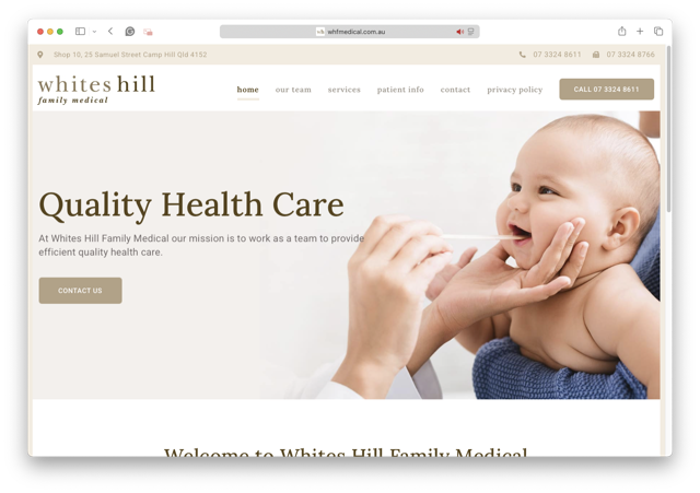
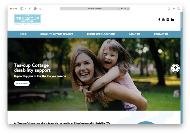
For inspiration, we looked at websites like White Hills General Practices and Tea Cup Cottage. The client wanted to convey an elegant, positive vibe with smiling faces - a warm welcome to their customers.

A smiling woman hugs a laughing boy in a wheelchair on a sunny outdoor path. Text overlay reads: “Need disability help immediately? We provide 24/7 service—call us anytime.” A “Call us” button is visible.

The draft

The client didn’t come with a brand-style guide at the beginning. We initially picked Eminence - the purple colour of the NDIS logo - as our main colour. I put together a mock-up, but it didn't quite hit the mark. The design felt a bit clunky and not engaging enough.

So we pivoted. Our next attempt was a more solid but elegant style, sticking with purple but incorporating more white. This became the first real design of the website.
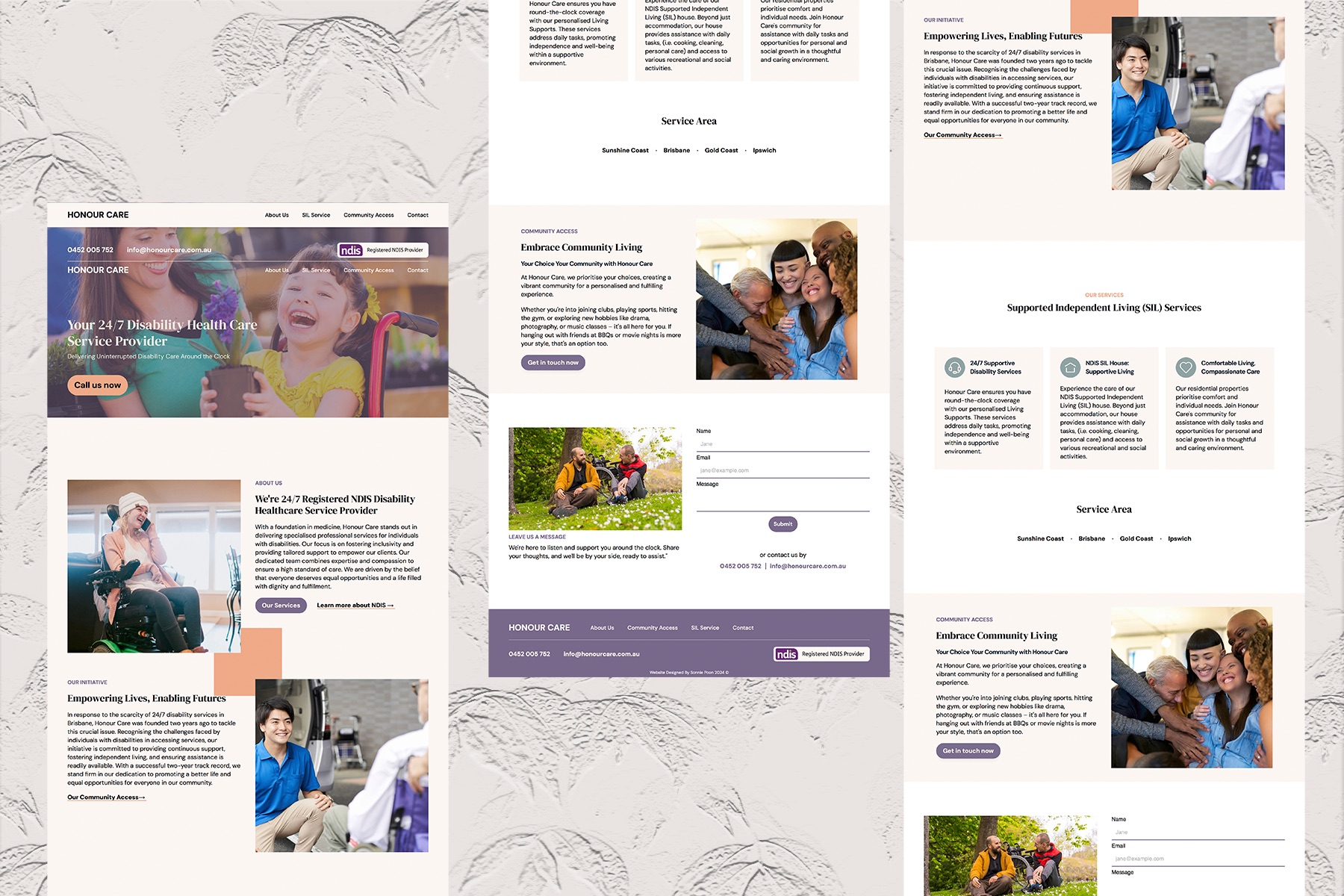
A collage of website mockups with a light, neutral background, showcasing pages for a disability care service. The designs feature diverse people smiling, service descriptions, navigation menus, and contact forms.

The first publish

The client was really happy with how the design went!

As time went on, the client updated their style guide and brand tone. They wanted a neat, clean, and professional look. Orange and blue became the new main brand colours. Our original design was too fancy for the new brand. Therefore, I softened the approach, adding rounded corners to images and forms. We unified all the font styles to strengthen the brand identity.

We also trimmed down the content on each page. This helped boost engagement and made everything more readable.
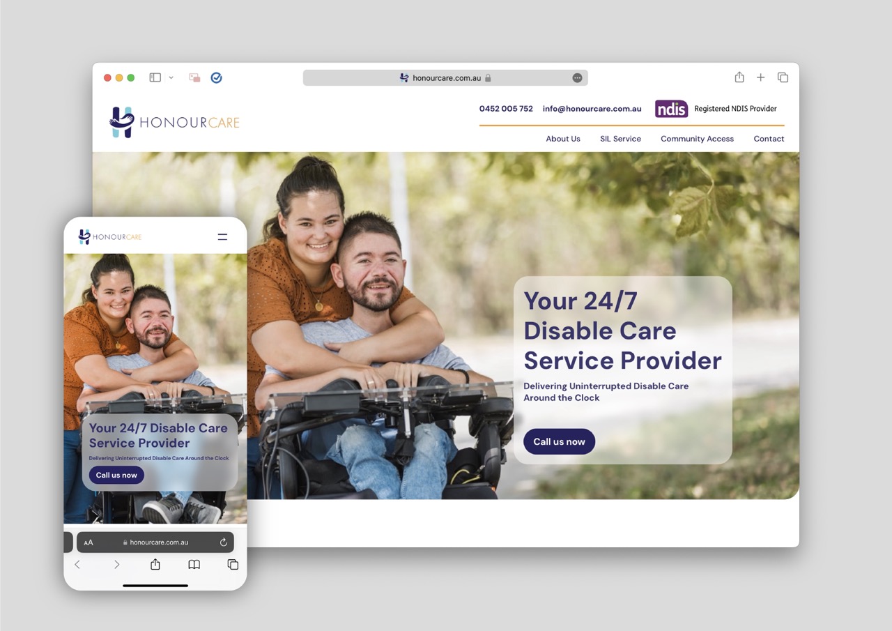
A website homepage for Honour Care shows a smiling woman embracing a man in a wheelchair. Text reads, Your 24/7 Disable Care Service Provider. Delivering Uninterrupted Disable Care Around the Clock.

The outcome

It's been quite a journey with Honour Care! We've come a long way, always aiming to give the best experience to both the client and their audience. Looking back, it's amazing to see how far we've come from that first meeting to the polished, professional site we have now.

On Behance:

View more similar projects

A user-centric design survey interface displayed on cards guides users through steps like entering a name, rating frequency, selecting platform experience, scanning a QR code, and ends with a thank you message—all in a pink and white color scheme.

TransLink Survey

A uni-coursework case study to design a survey for TransLink to investigate whether public transportation should be complimentary.

A desktop computer, laptop, and smartphone showcase the same landing page design for

Primal Wellness

A UI/UX case study for Primal Wellness. This project focused on building a transparent, professional online presence and improving business automation.

A computer monitor displays a CRM dashboard with client records, appointment details, and forms, surrounded by additional overlapping screens from the web portal showing similar data and user profiles on a light background.

Synapse CRM v2.0+

Designed and developed SynapseCRM, a custom web portal that automates client record management and streamlines workflows for a naturopathy business.