A uni-coursework case study to design a survey for TransLink to investigate whether public transportation should be complimentary.
The beginning…
This project aimed to design an interactive survey system to gather public opinion on railway budget allocation priorities. The survey was to be displayed on touchscreen interfaces located in train stations, making it easily accessible to a wide range of users. It targeted a diverse audience, including adults, elderly individuals, and people with disabilities, to ensure it captured valuable feedback from various perspectives.

UX/UI considerations
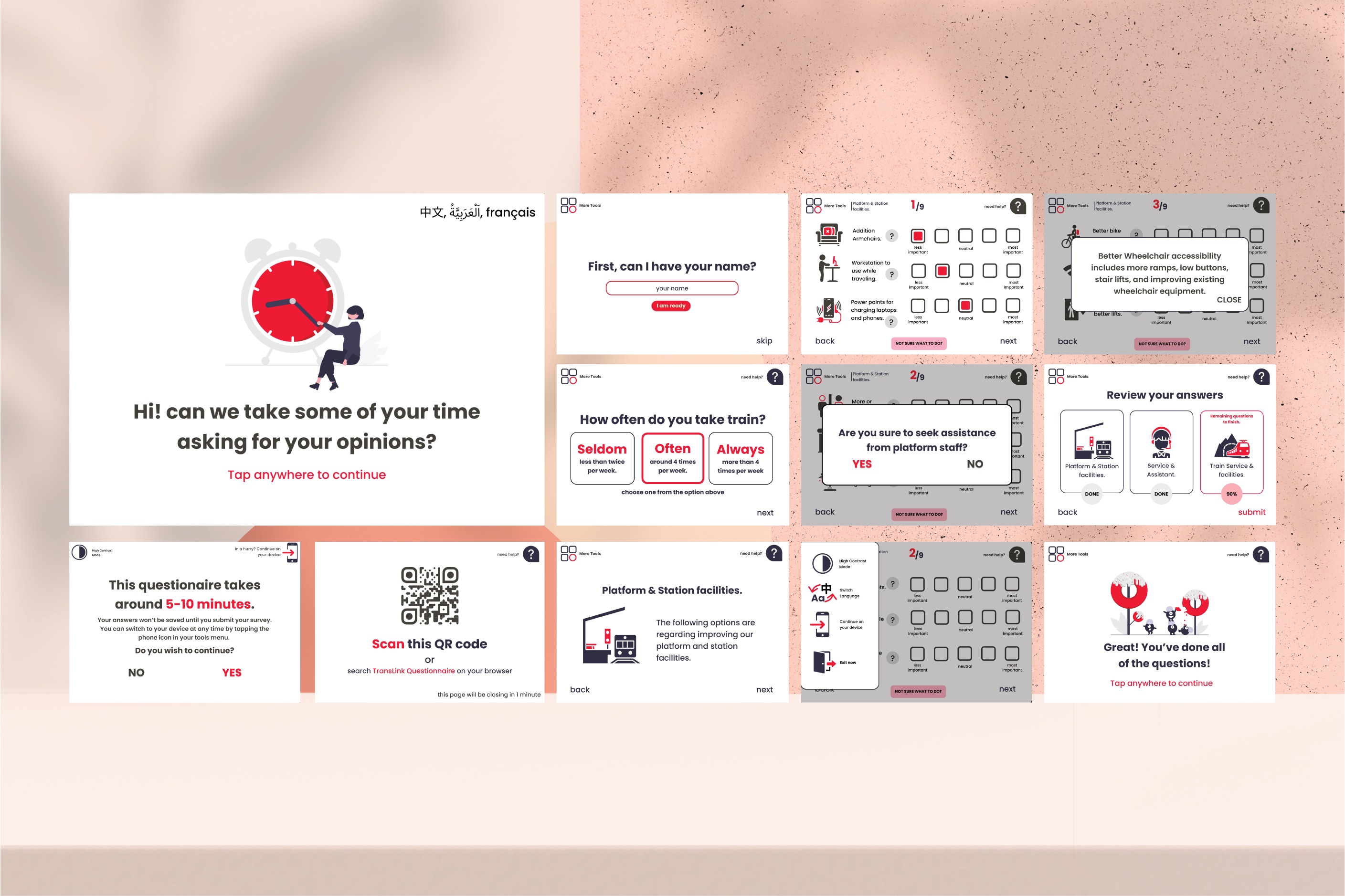
The original survey consists of 30 questions. To make it more manageable for people waiting for trains, I divided the survey into three sections, each designed to take around 5-10 minutes. Users will have the option to complete the survey on their devices or continue on their phones.
Accessibility
In developing this survey, accessibility and inclusivity were at the forefront of my design process. I implemented several key features to ensure that users of all abilities could easily participate.
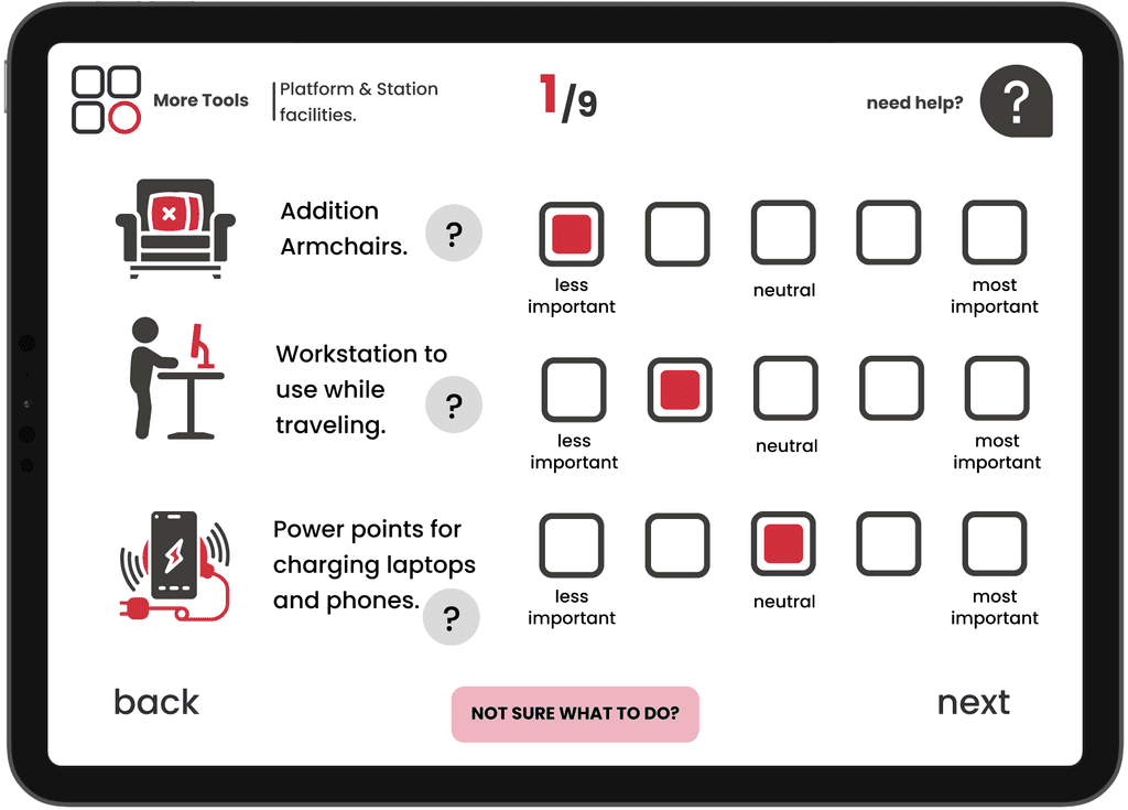
One of the primary design elements was the use of large buttons with ample spacing between them. This approach not only makes the interface more visually appealing but also significantly improves usability for those with motor skill challenges or visual impairments. To complement this, I incorporated large, clear text for navigation, guiding users seamlessly through the survey.

Applying Hick's Law, I carefully reduced the number of decisions required on each page. This streamlined approach helps prevent cognitive overload and makes the survey more manageable for all users, particularly those who might struggle with complex interfaces.

The survey also includes accessibility features such as a high-contrast mode for users with visual impairments, language switching capabilities for non-native speakers, and a text-to-speech function for those who prefer or require audio assistance. These features ensure that the survey is accessible to a wide range of users with diverse needs.
See the full prototype:
What would I have done better?
Reflecting on this project four years later, I've identified several key areas where I would apply my current understanding of UX principles to improve the design. This was my first true UX/UI project, and I've since learnt valuable lessons about user-centric design.
1. Tailoring the User Experience: The original survey was a one-size-fits-all approach, with a lengthy list of questions that weren't relevant to all users. For instance, questions about wheelchair accessibility were irrelevant to users who didn't need them. If I am re-doing this today, I would implement onboarding surveys or a conditional logic-based questionnaire. This would dynamically tailor the survey to each user's specific needs and interests, providing a more personalised and relevant experience and reducing user fatigue.
2. Simplifying the Rating System: The original 5-point rating scale, while offering granular feedback, led to decision fatigue and lower user engagement. In a new iteration, I would simplify this to a 3-point scale: positive, neutral, and negative. This reduction in options would make the decision-making process faster and more intuitive, encouraging a higher completion rate and more decisive feedback.
3. Enhancing the User Journey with Clear Endpoints: The lack of a clear "submit" button on each page was a missed opportunity. This oversight could have left users feeling disconnected from the feedback process. I would add a prominent submit button on every page. This small but crucial addition would serve as a positive endpoint, providing users with a sense of completion and control, ultimately encouraging them to engage more with future surveys.