Designed and developed SynapseCRM, a custom web portal that automates client record management and streamlines workflows for a naturopathy business.
The Challenge
The client, Primal Wellness (formerly MBHK), was struggling with a traditional, paper-based system for managing client records. As their business grew, their physical folders and handwritten notes became disorganized and difficult to search, leading to issues with client recognition, especially with similar names. 📝 The client's business growth created a demand for a more efficient and professional workflow, including the ability to generate and export professional PDF reports for clients.
Their typical workflow—from meeting a client to generating a report—was slow and manual. They needed an automated system to improve productivity and elevate their brand image.
My Role & Solution
I was tasked with designing and building a tailored web application to solve these problems. Over 2.5 years, through an iterative process of testing and deployment, I developed SynapseCRM, a custom solution designed to digitise their workflow and manage client data. The version demonstrated is 2.65.
SynapseCRM v1.0: The Initial Build
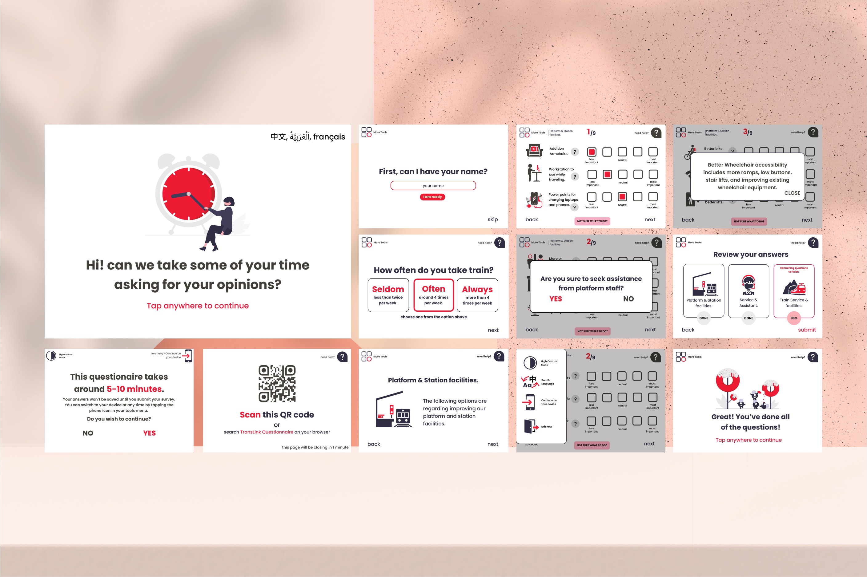
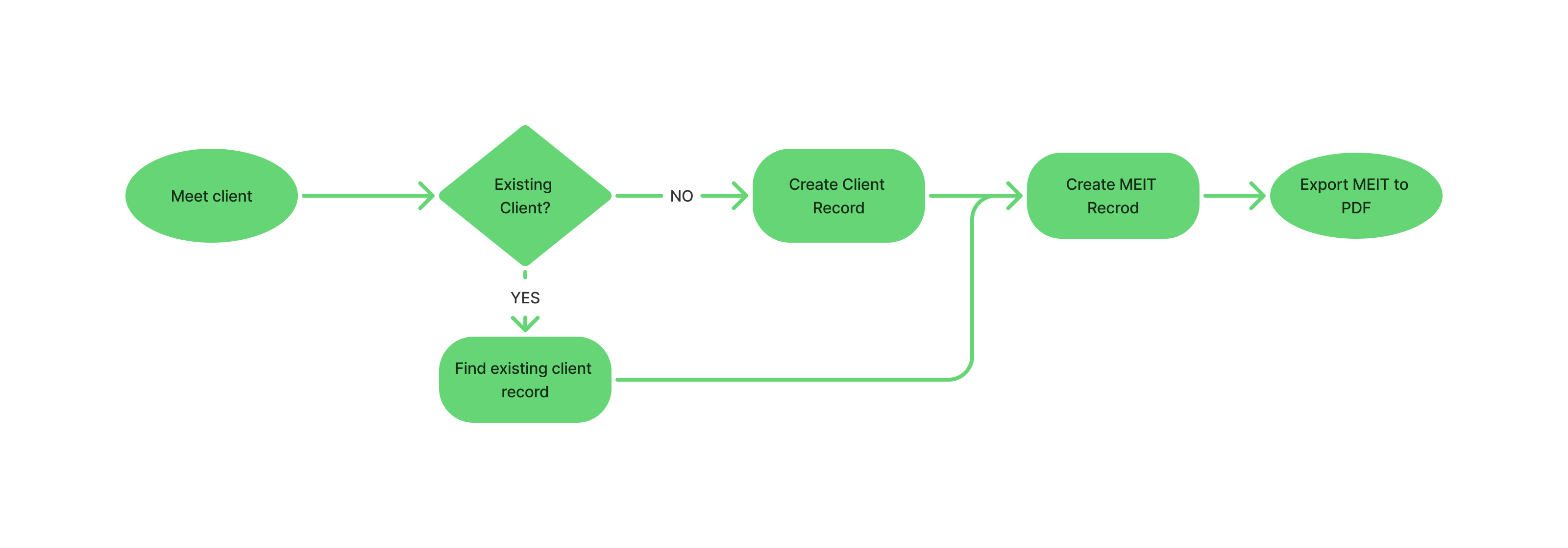
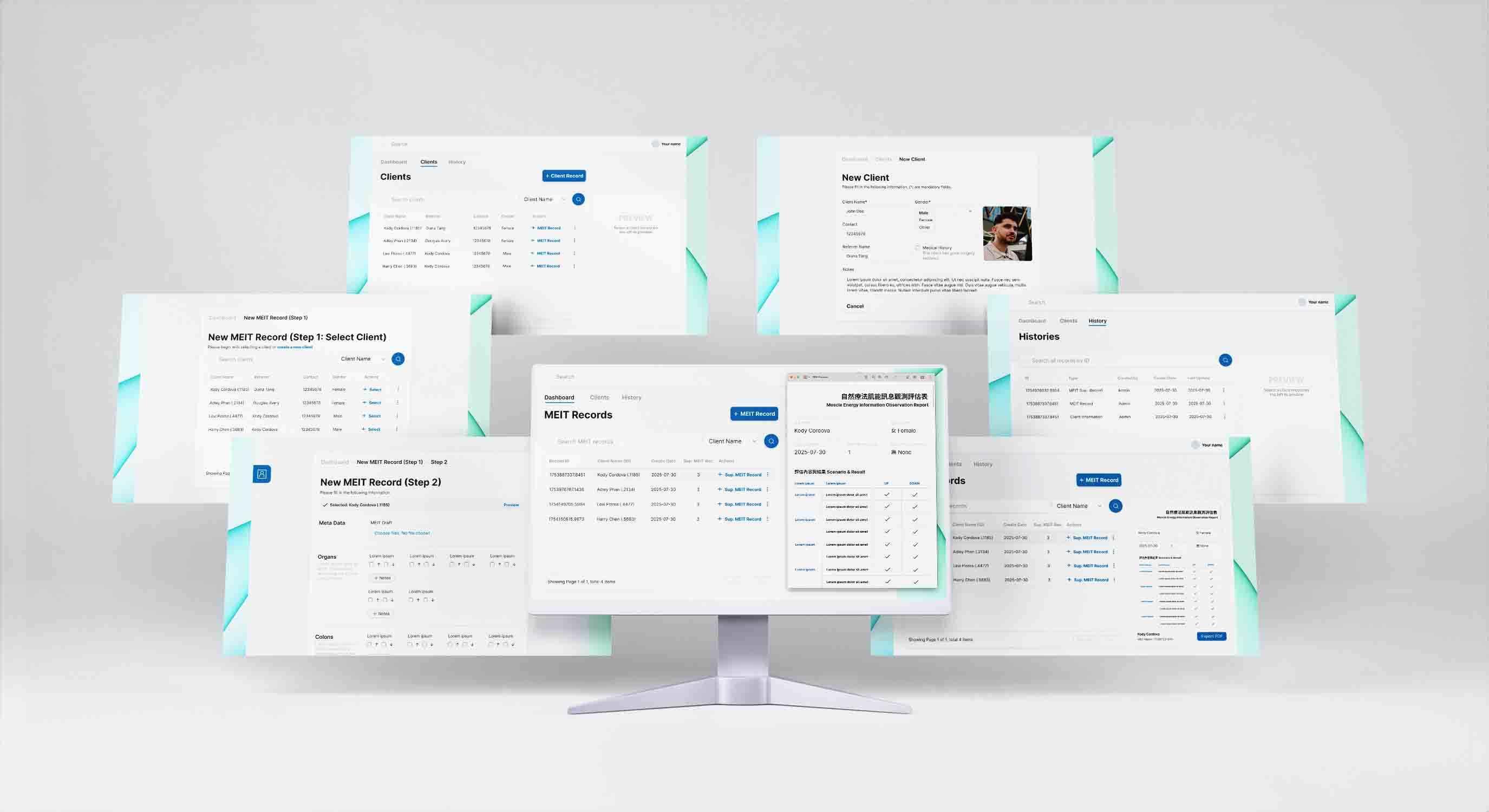
The first version was a simple graphical user interface (GUI) that pulled data from a backend via an API. The workflow was designed around the client's initial process: a user would select a record from a dropdown menu and proceed with creating a MEIT record.
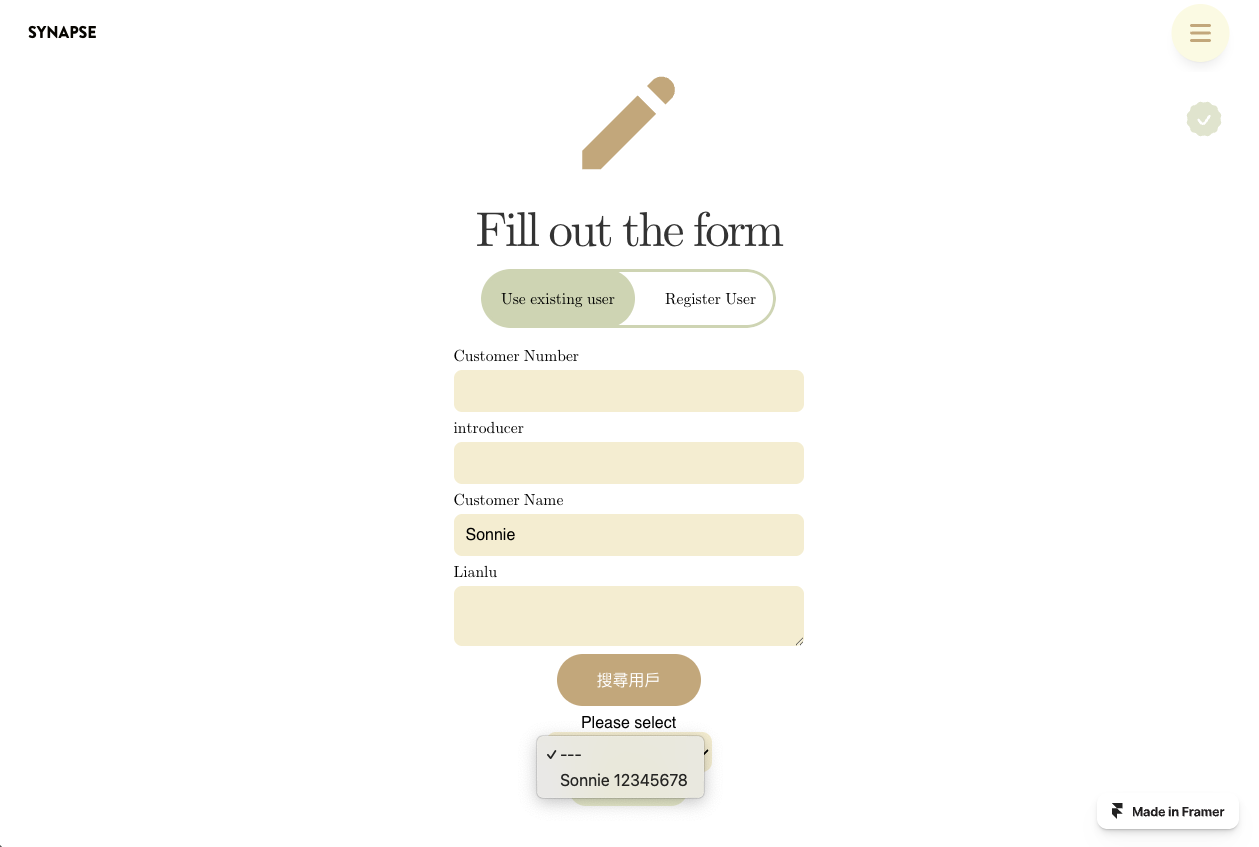
However, this version had a critical flaw: the dropdown only displayed the client's name and ID, making it difficult for users to select the correct record. This highlighted a key gap in the initial user stories, as it failed to consider the need for previewing client details before selection.
SynapseCRM v2.0: The Iterative Improvement
After a series of revision sessions, I worked closely with the client to better understand their user stories. This led to a complete overhaul of the CRM, focusing on a more robust and holistic user experience.
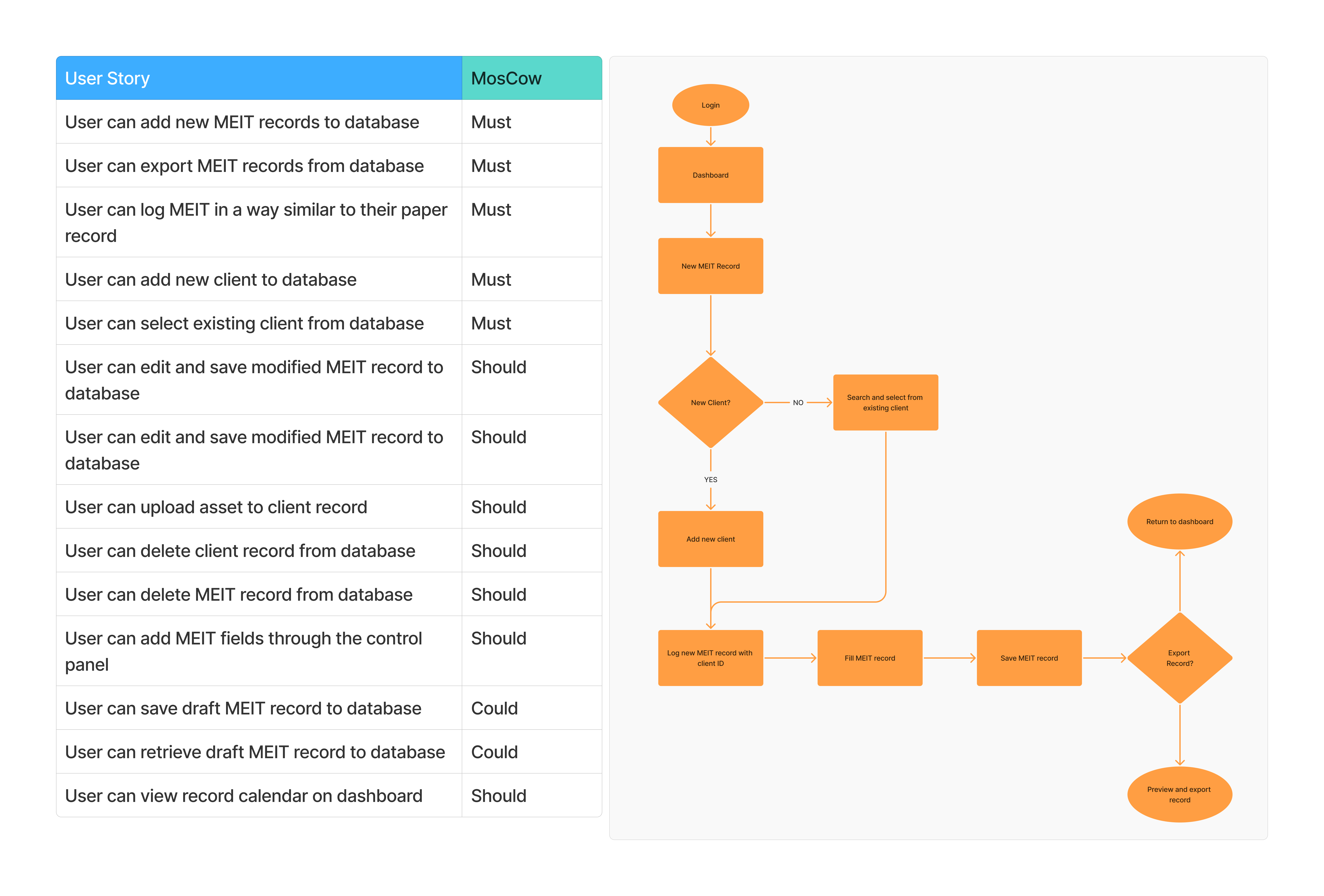
This version introduced key features to better organise and manage data:
A data table for a clear overview of all client records.
Search and filter functionality to quickly find specific data within the table.
The ability to preview client information by selecting a record from the table, solving the primary pain point of V1.0.
Seamless integration between client creation and MEIT record creation.
The ability to export professional PDF reports after record creation, fulfilling a key business requirement.
This version successfully solved the problems of manual data recognition and inefficient workflow. It significantly improved the user experience and allowed the business to scale its operations more effectively.
Technical Implementation & Constraints
The project was deployed in a local environment to protect customer data, as the client did not want to upload any sensitive information to a third-party database. I chose to build the web portal using Statamic, a powerful flat-file CMS built on the Laravel framework. This decision was strategic for several reasons:
Accelerated Development: Statamic's built-in controllers and backend connections allowed me to build the application within the two-month timeframe.
Data Security: As a flat-file CMS, it eliminated the need for a traditional database, offering a more secure solution for local data storage and reducing the risk of data breaches.
Future Scalability: Unlike a C# desktop application, using a web-based portal like Statamic allows for future expansion, providing the client with the possibility of making the portal accessible online with appropriate security measures if their business needs change.
Despite these advantages, the project had specific limitations, such as the inability to implement complex features like data modification and deletion due to Statamic's constraints. Given the project's tight timeline, I leveraged TailwindCSS UI for the majority of the web application's design to reduce the development time, and allowed for more testing.
My continued work on this project, demonstrated by its latest version, highlights my commitment to finding better solutions and overcoming these challenges.