A playful, accessible digital experiences for children. Specialising in educational apps, emotional design, and intuitive user interfaces.
What is FIDJOO?
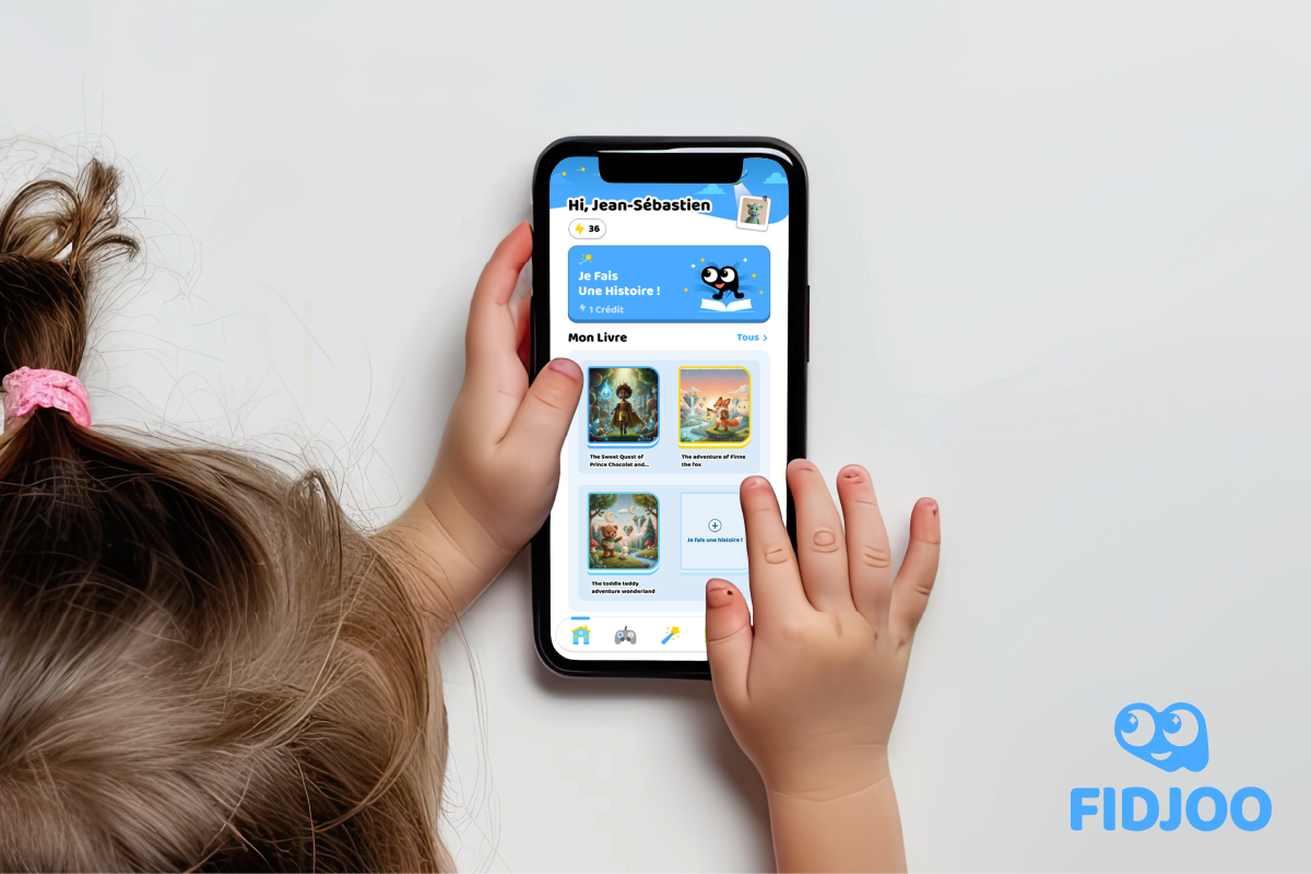
FIDJOO is an educational app designed for kids, with the goal of turning screen time into story time. Through a guided, AI-powered creation process, kids can build their own storybook and then read the story they’ve created.
This case study shows the first draft of the high-fidelity prototype for FIDJOO mobile app.
The biggest challenge was simple but tough:
How do we invite kids who can’t read yet to want to read a storybook?
So how?
Table of Content
Target Audience
The main users of the app are:
Kids from Kindergarten to 7 years old.
Parents of these kids.
Possibly teachers.
What's special about our main target audience?
Kids around 3–5 years old can’t read well yet. They rely heavily on visuals and are highly sensitive to colours, shapes, and numbers.
They are using an "unfiltered" brain. From my observations while building LEGO instructions for my kindergarteners, traditional UI patterns like greyed-out options or disabled states don’t work well for kids. Instead of filtering choices, these techniques create extra cognitive load and raise more questions.
Kids love finding similarities. We intentionally keep icons and wording consistent across the app—reusing the same visual language for the same functions helps them build understanding quickly.
Kids love discovering things. They click around, explore freely, and often understand functions faster than we expect.
My PDFs are full of kindergarteners’ graffiti—and no matter how hard I try to hide the “Edit PDF” button, they always find it.
Based on this, we shouldn’t be too afraid of the app being “hard to understand.” What matters most is whether it’s fun enough to invite exploration.
So, how can I make the app fun to explore?
Decorations & Atmosphere
Graphics and themed decorations are a big part of inviting kids into a story. We want the app to feel like entering a special zone—one where creativity is unlimited.
At the same time, we carefully limit distractions so kids don’t lose focus in the middle of reading. It’s about preserving creativity without overwhelming them.
Feedback Loop
Kids love encouragement. Applause, positive reactions, and small celebrations motivate them to keep going. This positive feedback loop helps invite them to read more books.
The Challenge &
How I Solved It.
The app is in French. And the only French I knew at the start was “Bonjour!”
So the question became:
How can I design something readable and intuitive for kids in a language I don’t speak?
→ This is where AI really shone.
I know what feels friendly and readable for kids in English, so I used AI to translate and verify those terms in French—making sure the tone stayed kid-friendly and natural.
The Design
The Invitation to Explore
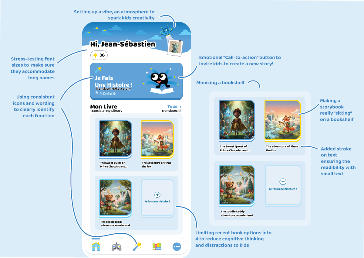 The goal isn’t to make a purely graphic-based app. We want kids to understand what each function does and learn a new word associated with it.
Even my adult brain learnt a few new French words along the way.
The design has provided many visual hints to help kids understand what each function does without needing explainations. And set a good vibe to get started.
Progress & guidiance (Inspired by Duolingo)
Taking Duolingo as a reference, we introduced confirmation and next-step button groups to help kids stay focused and feel progress—without feeling bored or overwhelmed.
In the final flow, creating a story takes at least five steps. Without guidance, kids can easily feel lost.
Duolingo solves this nicely by replacing the confirmation button with a banner + button group once a choice is confirmed. This banner becomes a perfect place for short, encouraging prompts.
For example:
When a kid selects a fox as the main character and confirms it, the prompt says:
“Bravo! Fox Adventurer!”
This both confirms their choice and keeps their excitement going.
The Progress bar also helps improve engagements when being as a playful distraction. When kids enter the screen, they first notice a tiny mascot on the progress bar. Each completed step moves the mascot forward.
This small, playful distraction encourages kids to “help” the mascot finish its journey by completing the story-building process.
Book reading experience
It’s well known that moving elements grab kids’ attention more than anything else.
So during reading mode:
We remove unnecessary graphics
Place the video at the centre
Highlight text when audio plays
Some engaging visuals remain—for example, pause, restart, and leave buttons.
The goal isn’t to prevent kids from making mistakes, but to encourage discovery. If a kid taps the restart button by accident, that’s okay—they learn immediately. They might even find it fun once they realise what it does.
We also want to encourage kids to keep reading. When a story ends, we don’t just say “done.” We add applause and a hook to invite further interaction—encouraging kids to continue reading or explore more stories.
This helps extend engagement and builds a habit around reading.
The Development
This design task also included a development component. Due to the given timeframe (three days, just 3 days!!!!), I wasn’t able to complete the full development phase.
What’s shown here is a partial implementation to showcase my development capability in React Native.
(Note: the client later closed their Firebase server, so some images are no longer viewable.)
What's Next —
and what I learnt
Unfortunately, after the first high-fidelity concept was delivered, the client changed the project scope to focus on developing a tablet app instead (case study coming soon). As a result, this design didn’t get the opportunity to go through further user testing.
That said, there were still important learnings from this process.
Key learnings
Some buttons were still hard for kids to understand
While I didn’t have the opportunity to test with French-speaking kids, I tested an English version of the app with my kindergarteners.
They struggled to understand that the process they were going through was creating a new story.
→ This may also be due to the prototype nature of the app. With real dynamic selections and meaningful outputs, kids would likely learn the flow within one or two attempts.
→ Kids were often very excited, but not always aware of what they were doing.
Client feedback: visual noise
The client liked the banner, but felt the side element was too visually noisy. The star sparkles in the background became a distraction rather than an enhancement.
However, the idea of interacting with the mascot itself was received very positively — that part worked well.
How I would make it better next time
Start with user testing earlier — especially with kids
If more time were permitted, I would prioritise user testing before finalising decisions. Even though I’ve worked with children for many years, observation alone shouldn’t replace structured testing.Use comparable apps as testing references
I would ask kids to try a similar app first, then observe:where they struggle
what they understand intuitively
what they ignore completely
This helps separate design problems from learning curves.
Don’t make the app too easy — but don’t overdo it
Kids are naturally curious. “The more you tell them not to touch something, the more they want to.” Adding a small level of challenge can increase motivation and discovery. However, if the difficulty goes too far, engagement drops. Finding the right balance is critical.Spend more time on micro-interactions
More time would be dedicated to:
mascot reactions and animations
button click feedback
navigation state changes
These small details are often what kids notice the most, and they play a big role in encouraging exploration and sustained engagement.